LUBALIN
TYPOGRAPHY IS
EXPRESSION
Q1
Herb Lubalin — An Influential Typographer
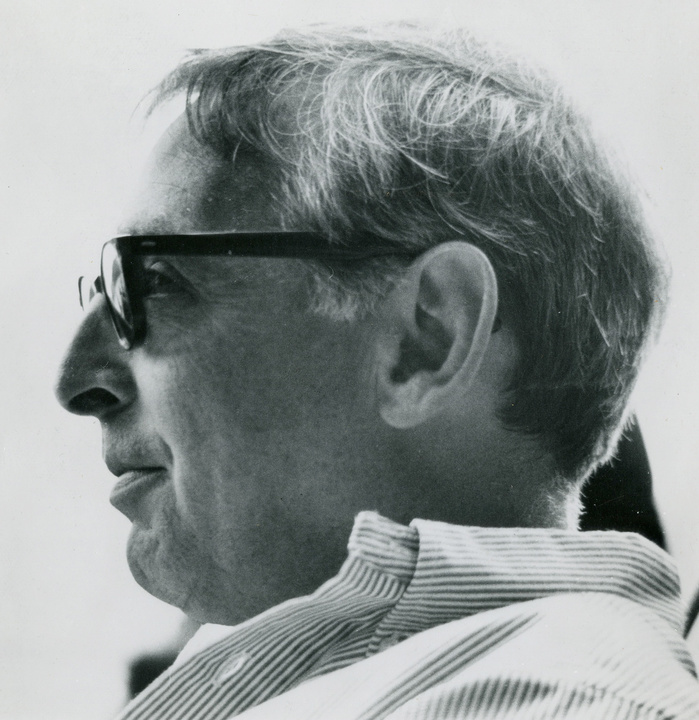
Herb Lubalin (1918-1981) emerged as one of the most significant figures in American graphic design at a pivotal moment: the postwar period in which advertising culture was rapidly expanding, printing technology was shifting from metal to photo-typesetting, and graphic designers were beginning to claim authorial status equal to that of copywriters and art directors. It was within this specific cultural and technological context that Lubalin's particular genius became possible and recognizable (Shaughnessy, 2015; Woodham, 2016).
What distinguished Lubalin from his contemporaries was not formal training in traditional typographic convention - he famously claimed to ignore such rules - but rather an intuitive understanding of letterforms as visual objects. He treated type not as a neutral carrier of language but as a material with its own expressive weight, capable of generating meaning through form, scale, and spatial arrangement. This approach was most visible in his editorial work for magazines such as Eros, Fact, and Upper and Lower Case, where headlines were not simply set but designed as autonomous visual compositions (Kinser et al., 1981; Shaughnessy, 2012).
Lubalin's influence is also inseparable from his institutional role. As co-founder of the International Typeface Corporation (ITC) in 1970, he helped establish a new model for type licensing and distribution that shaped how typefaces were commercially disseminated in the late twentieth century. In this sense, his influence extended beyond individual works into the structural conditions of typographic practice itself (Yamamoto, 2023).
Although his reputation temporarily declined with the rise of computer-based design in the 1980s and 1990s - a period that favoured a different visual sensibility - recent scholarly reassessment has reaffirmed Lubalin's place as a foundational figure whose work prefigured many of the concerns of contemporary typographic and visual communication practice (Shaughnessy, 2015; Woodham, 2016).
Q2
What is the Most Significant Contribution
Herb Lubalin
Made to the Field of Typography?
Lubalin's most significant and singular contribution to typography is the concept of expressive typography - a practice in which the typographic form itself carries meaning equal to or beyond the semantic content of the words it sets. Rather than treating type as a transparent medium through which language passes, Lubalin insisted on its opacity: its shape, spacing, weight, and arrangement as active generators of meaning (Woodham, 2016; Shaughnessy, 2015).
This is most precisely demonstrated through his work in logo design and editorial headlines. In compositions such as the Mother & Child logo (1965) and his title treatments for Eros and Fact magazines, Lubalin compressed letter-spacing to the point where individual characters became interlocking visual units rather than discrete alphabetic signs. The result is a typographic density that is simultaneously readable and image-like - requiring the viewer to slow down and negotiate the form before arriving at meaning (Shaughnessy, 2012).
This contribution is distinct from Lubalin's other achievements. Designing the Avant Garde Gothic typeface or co-founding ITC were significant acts, but they were, in part, extensions of industry practices already in motion. The development of expressive typography, by contrast, represents a genuinely new paradigm - a shift in what typography was understood to be capable of doing. As Woodham (2016) notes, Lubalin positioned typography as a form of pictorial metaphor, fundamentally expanding the scope of the discipline.
For contemporary designers, this contribution remains immediately relevant. The practice of using type as image - visible in contemporary logo design, poster culture, and web typography - traces a direct lineage back to Lubalin's willingness to treat the letterform as a plastic, expressive material rather than a utilitarian one (Shaughnessy, 2015).
Q3
What Has
Herb Lubalin's
Contribution Inspired or Influenced in the Field of Typography?
Lubalin's legacy is best understood not as a collection of specific works to be imitated, but as a shift in how designers understand the relationship between type, image, and meaning. His pioneering of expressive typography opened a conceptual space that subsequent generations have continued to explore and extend, often without directly referencing Lubalin by name (Shaughnessy, 2015; Woodham, 2016).
“Expressive typography opened a conceptual space that subsequent generations have continued to explore — often without directly referencing Lubalin by NAME."
The most direct lineage runs through the field of logo design and typographic identity. Designers who came after Lubalin - including those working in the 1980s Swiss-influenced revival and the more eclectic movements of the 1990s - inherited his understanding that a logotype is not merely a word but a visual object with its own internal logic. This sensibility remains central to contemporary brand identity design, where type and form are routinely fused into a single expressive unit.
Lubalin's influence is also visible in the continued relevance of ITC Avant Garde Gothic itself. The typeface remains in active use across advertising, editorial, and digital design, its geometric neutrality and ligature-rich character set making it adaptable to both historical and contemporary contexts. Its revival in recent decades - particularly in fashion and cultural publishing - reflects ongoing interest in the visual language Lubalin helped establish (Yamamoto, 2023; Adobe Fonts, n.d.).
More broadly, Lubalin can be seen as an early practitioner of what is now called human-centred communication design: the idea that the viewer's perceptual and cognitive experience should shape formal decisions, not merely convention or taste. His typographic compositions require active reading, participation, and interpretation - qualities that align closely with how contemporary interaction designers think about engagement and attention. As a design student working across both print and web, I find this dimension of Lubalin's work particularly resonant: the concern with how form guides experience is as relevant to interface design as it is to editorial typography (Woodham, 2016; Shaughnessy, 2015).
Q4
Herb Lubalin's
ITC
Avant Garde Gothic
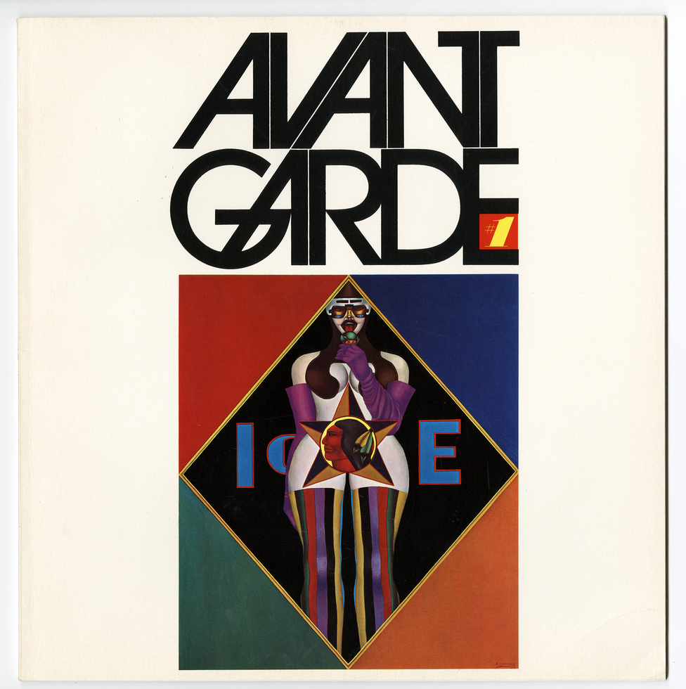
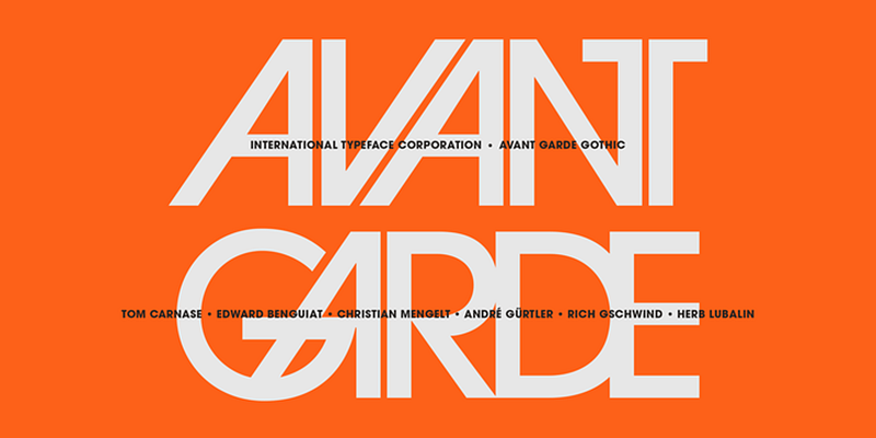
ITC Avant Garde Gothic was designed by Herb Lubalin and Tom Carnase and released in 1970 through the International Typeface Corporation (ITC) - co-founded by Lubalin himself (Adobe Fonts, n.d.). The typeface grew from the logotype Lubalin created for Avant Garde magazine in the late 1960s. Its formal vocabulary draws directly from Bauhaus geometric modernism and early European rationalism (Adobe Fonts, n.d.).
Compared to Paul Renner's Futura (1927) - its closest geometric predecessor - Avant Garde Gothic is notably wider and more optically even. Where Futura's narrow lowercase lends a vertical, mechanical quality, Avant Garde Gothic is expansive and circular. This openness makes it more assertive at display sizes but less suited for continuous text, reflecting its origin as a magazine headline face.
A Typeface Comparison
Futura — 1927
HAMBURGEFONTS
Narrow · Vertical · Mechanical
ITC Avant Garde Gothic — 1970
HAMBURGEFONTS
Wide · Circular · Expansive
At its core, ITC Avant Garde Gothic is defined by near-perfect circular letterforms. The bowls of b, d, o, p, q are constructed from precise circles, and stroke width remains largely uniform throughout - creating a visual rhythm that is calm yet quietly energetic, each letter functioning as a module within a geometric system. Available in five weights with Condensed and Oblique variants, the typeface offers considerable flexibility across headline and display use (Adobe Fonts, n.d.).
bdopq
One of the typeface's most distinctive features is its extensive ligature system. Pairs such as AV, AT, TA, VA, and WA - where diagonal strokes naturally converge - are drawn as single, interlocking forms that eliminate the optical gap standard kerning would leave. This is not merely a technical refinement: it is a design philosophy. Lubalin's insistence on tight letter-spacing, combined with the ligature system, produces words that function as unified graphic objects rather than sequences of individual letters. As shown in Figure 4, the compressed treatment of "AVANT GARDE" demonstrates this effect precisely: the letters lock into a dense, rhythmically consistent form that reads as much as shape as it does as text (Adobe Fonts, n.d.).
Q5
Typographic Composition Analysis:
Mother & Child Logo

The Mother & Child logo, designed by Herb Lubalin in 1965 as a proposal for a magazine of the same name that was never published, is among the most celebrated typographic compositions of the twentieth century. It has been exhibited, reproduced, and analyzed continuously since its creation, and is considered a perfect exemplar of Lubalin's philosophy that typography and image are not separate categories but a single, unified expressive act (Shaughnessy, 2012; Flat File, n.d.).
The composition consists of the words "mother" and "child" set in a tightly compressed serif typeface. The two words are stacked: "mother" appears in the upper portion, and "&child" - with the ampersand integrated directly into the word - appears below, the entire phrase enclosed within an oval formed by a large ampersand. The formal logic is elegant: the ampersand, one of typography's most visually complex characters, is used simultaneously as a linking grammatical symbol, a visual container suggesting the womb or an embrace, and a structural element that binds the two words into a single unified form (Shaughnessy, 2012).
The hierarchical reading of the composition is carefully controlled. At first glance, the eye reads the large ampersand as a shape. On closer inspection, the words "mother" and "child" resolve into legibility. This layered reading - from visual form to semantic content - is precisely the kind of experience Lubalin sought to create. Typography becomes an image that rewards sustained attention (Shaughnessy, 2015).
The tight letter-spacing, the integration of the word "child" within the curve of the ampersand, and the careful balance between the two weights and scales of text create a composition of remarkable density and intimacy. The oval formed by the ampersand gives the whole a sense of enclosure and tenderness that amplifies the meaning of the words themselves. It is a masterclass in how formal typographic decisions - spacing, scale, and the choice and manipulation of a single character - can generate conceptual and emotional resonance (Woodham, 2016; Shaughnessy, 2012).